Mirror.com, a Responsive Website and Logo Design

Background
Mirror is a successful clothing brand that is looking to dive into the digital world for the first time. I was tasked with creating a logo and responsive website for this clothing brand. The brand considers themselves to be modern, neutral, fresh and clean and they asked that this be portrayed in their website and logo.
Scope: Responsive website, logo design, brand identity, visual design
Role: UX Designer (Visual Designer, Research, User Testing)
Duration: 6 weeks
The Process

Research
Research Goals
Before jumping into the design process I wanted to understand what it is that people like about online shopping and what website features they really love.
Research Methods
User Interviews
Survey
Competitor Analysis
User Interview Findings:
I interviewed 3 people ranging from ages 29-31. Overall, I found that all 3 prefer to online shop and they all online shop more than once a month. One person even online shops 20-30 times a month. Some online shopping features these interview participants love include one click payments, size guides, remembering credit card and shipping information, customer reviews, easy to navigate tabs and Apple Pay options. Some features they dislike include being forced to subscribe to emails, irrelevant ads and pop ups, shipping being calculated too late in the purchase process and no customer reviews or size guides.
Survey Results:
I distributed an anonymous survey to potential users and collected 18 responses. The most common sites that these participants visit when online shopping are Amazon, J Crew, Fabletics, Gap, Old Navy, Wayfair, Nordstrom, DSW and Sephora. Most people prefer to shop online over going to a store. A few people said they prefer to do both. When asked if they prefer to shop online on a phone or computer most people said they use both or just their computer. A hand full of people said they use their phone only. Some online shopping features that people love include one click payment options, auto filled credit card and shipping information, size charts, simple and easy navigation, customer reviews and good mobile site experiences.
User Persona
Based on my research findings I was able to create a user persona, Kaitlyn Miller.

About Kaitlyn
Kaitlyn is a married 30 year old living in the city. She works full time from home so she’s able to dress comfortably during the week but on the weekends she likes to step up her fashion game. She only needs a few professional looking clothing items for when she has the occasional in person meetings. Her wardrobe consists of casual but trendy items. She is willing to spend a bit more on her casual style because she is able to save money on professional clothing. She enjoys wine tasting, trying new restaurants, hanging out with friends, going to the beach. While enjoying these outings she likes to look and feel good.
Card Sort
After conducting my user research, I was able to create a card sorting activity to determine how my website design will be mapped out. I had a total of 10 participants who named 33 different categories. Based on a participant-centric analysis, the most popular sorting strategies resulted in the following 6 categories: Shoes, Accessories, Bottoms, Outerwear, One Piece and Tops. A few participants grouped items into gender specific categories and others groups items into seasonal categories.
Site Map
I created a site map, which shows a list of pages and subpages that will appear on Mirror’s website and how they relate to one another. My site map shows the categories I created based on the results of the card sort. All 6 of the most popular categories are shown below as categories for Mirror’s website.

User Flow
For the user flows shown below, I created 2 different tasks for Katilyn and I showed the different paths she could take in order to find a certain item or abandon Mirror’s site completely.
Task 1: Kaitlyn received an email that Mirror is having a winter sale for 50% off all coats.
Task 2: Kaitlyn needs a new sweater to complete her outfit that she plans to wear this weekend.

Responsive UI and Logo Design
After conducting my initial research, it was time to move into the ideate phase of the design process. Below is the process I followed in order to come up with my final designs.
Logo Design
The image below shows the different logo styles that I explored for Mirror. They have asked that we portray the brand as simple, clean and modern. This is something that I kept in mind throughout the logo design process. Through my sketches and Figma designs, I felt that these different logos shown below represent the clean and modern feeling that Mirror was looking to accomplish.

Style Guide
For my style guide, I chose to show several different elements of the Mirror website. Again, I wanted to give the website that modern and clean feeling so that helped me to choose the fonts and color scheme. I chose to show the typography, color scheme and the 4 logo styles that I thought fit the brand the best. The images show the type of clothing and style I was planning to show in my designs.

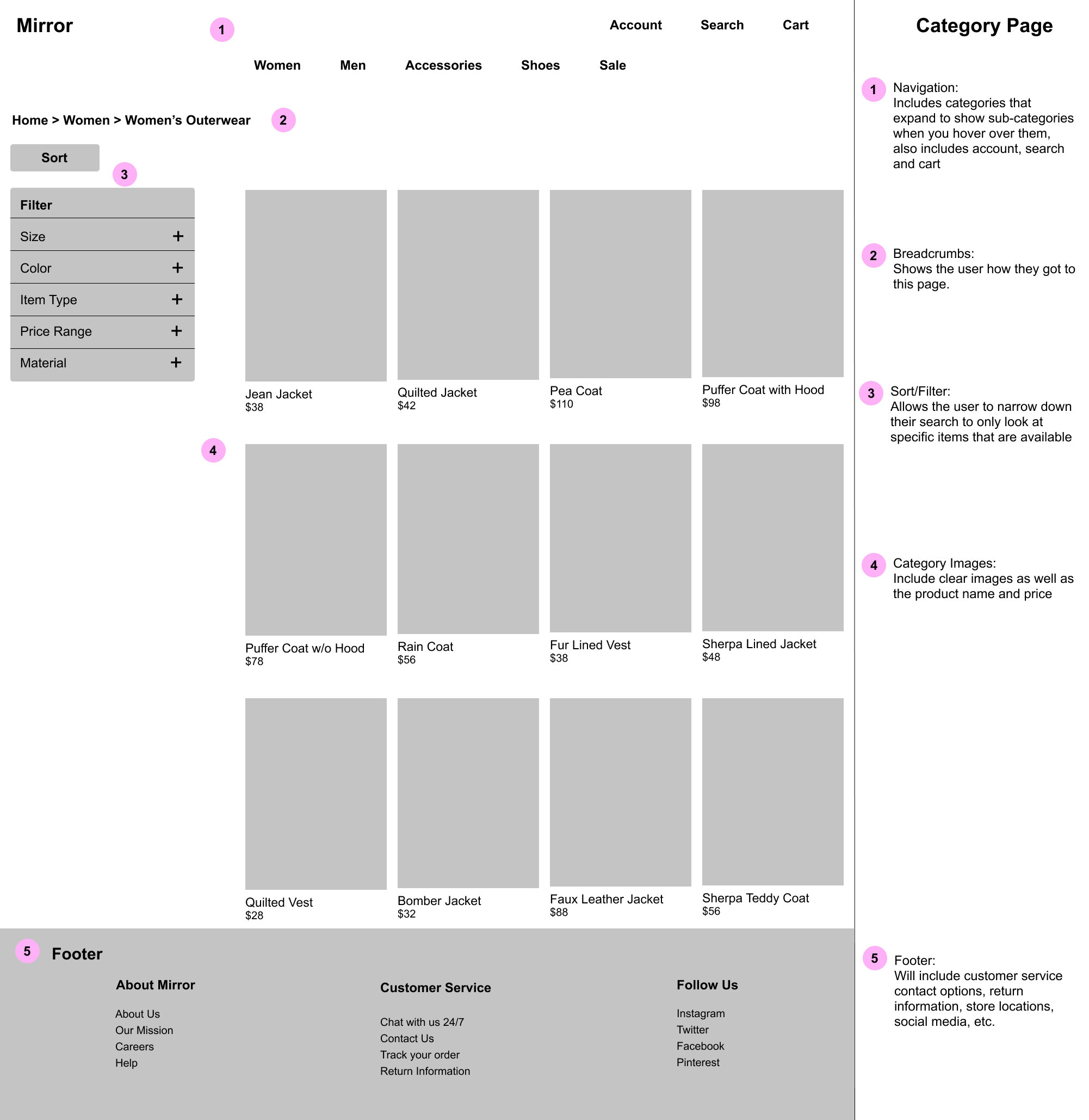
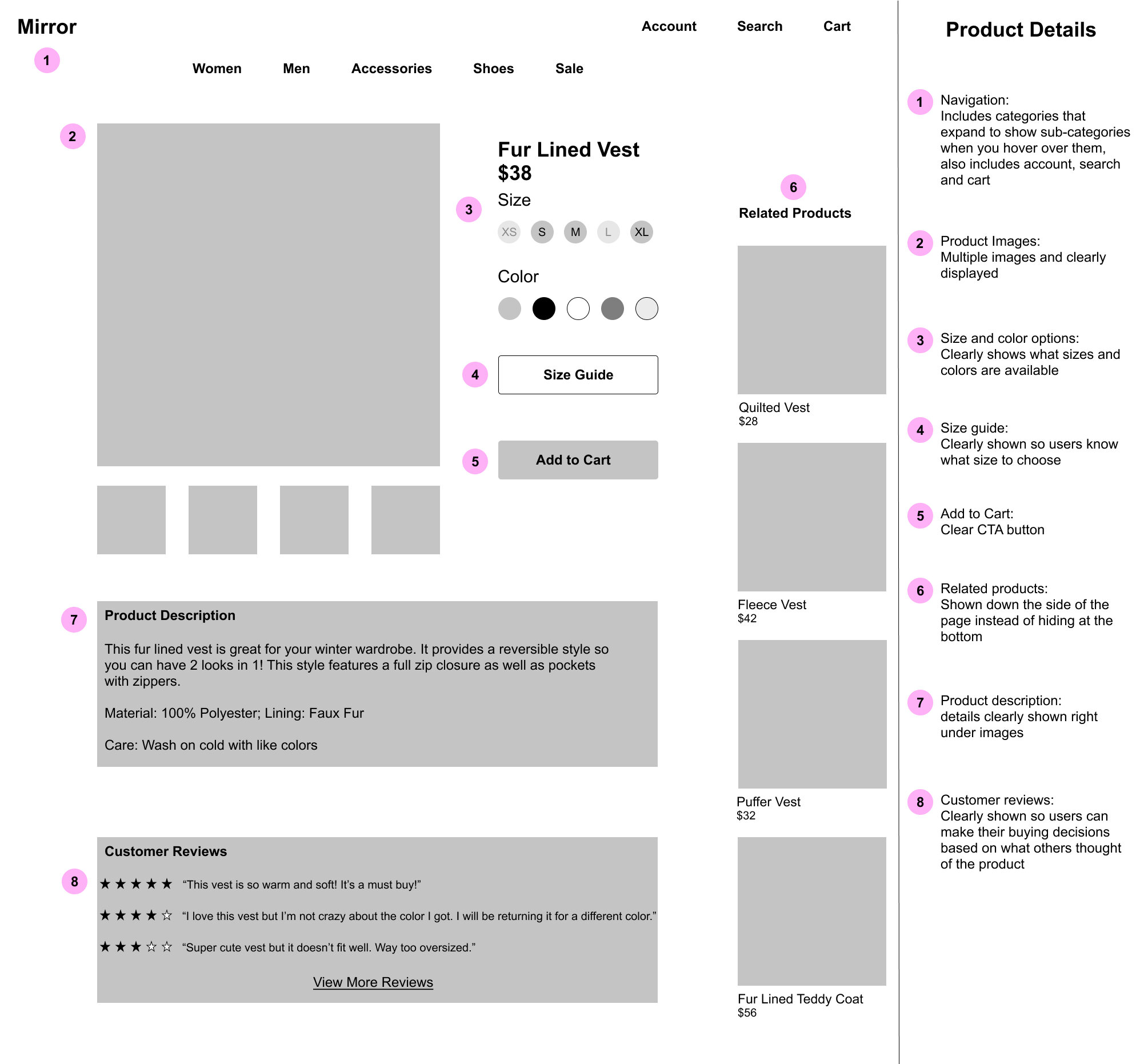
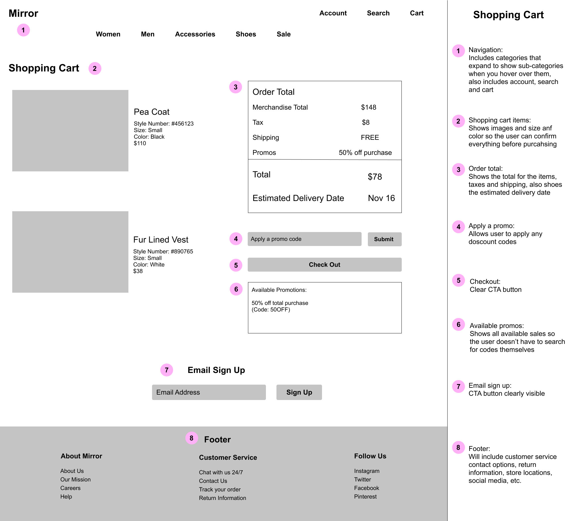
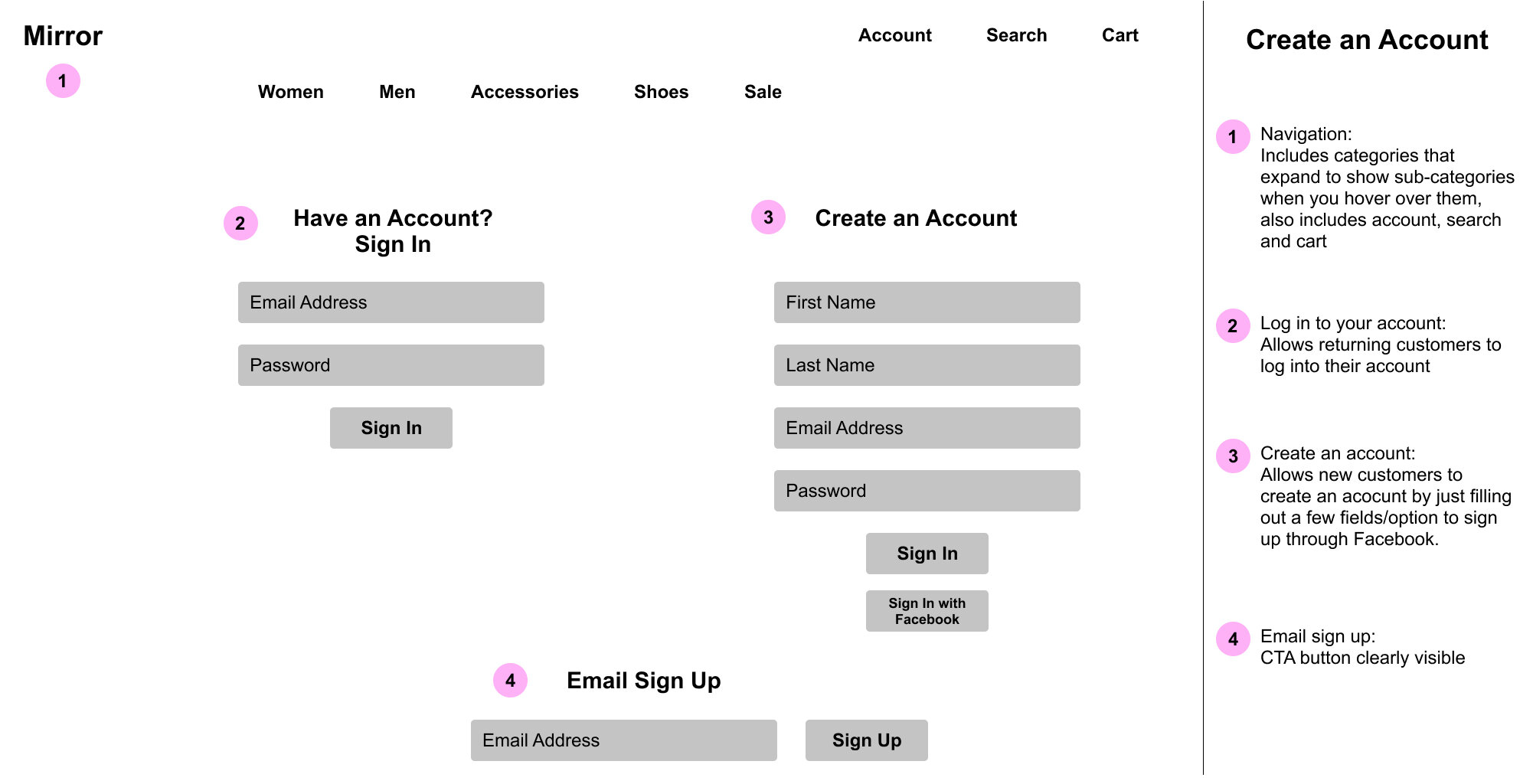
Wireframes
Before creating my full UI design, I created a wireframe for 5 different pages: a homepage, a category page, a product details page, a shopping cart page and an account login page. I wanted to give the user a feel for what the purchase process would look like and I thought these 5 pages displayed that in the best way. These wireframes show the blueprint of what the site will look like before adding in UI elements such as color, typography and images.

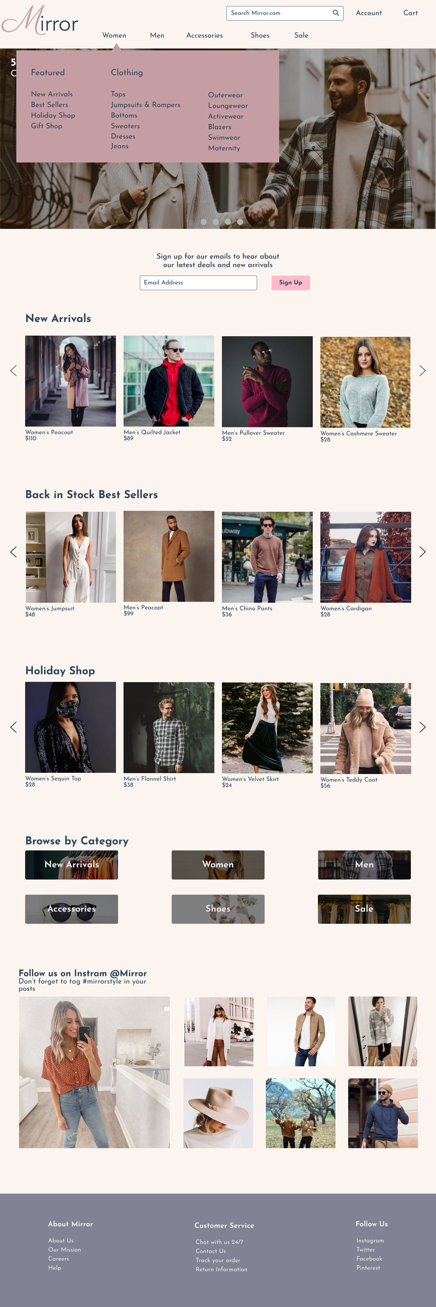
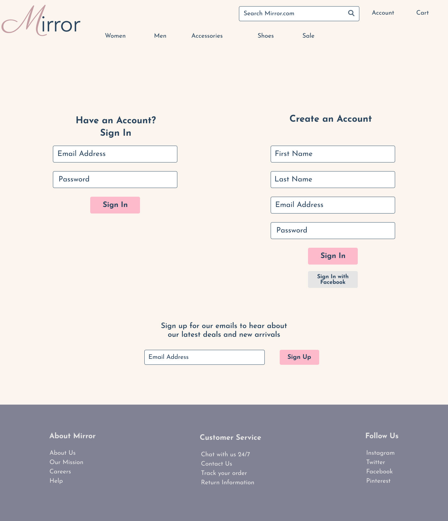
Responsive UI Designs
For the UI designs below I incorporated elements from my style tile and I settled on a clean and simple logo for the site. Once I added in several different UI elements, I made a few changes to my wireframe designs in order to keep each page looking clean, clear and easy to navigate. I chose images of young men and women wearing today’s current trends to go along with the overall look and feel of the website. I chose these specific colors and design elements because I wanted this site to be attractive to young men and women from all over. After completing my original designs, I conducted a usability test to gain feedback on what needed to be adjusted throughout the designs.


Usability Testing
Objective
My main objective was to test how easily a customer can find a product they are looking for, add it to their cart and check out. I was also looking to see if any users found any frustrations in my website designs.
Scenarios
I created a high-fidelity prototype in Figma based on three scenarios.
Scenario 1: You need to find the perfect dress for your office holiday party. You want to wear something elegant and eye catching but not too over the top. You come across Mirror’s website from an Instagram ad. How would you go about searching for a dress, adding it to your cart and checking out?
Scenario 2: You purchased your favorite pair of jeans last year from Mirror and you decided you want the same pair in a different color. How would you go about finding this pair of jeans and adding them to your cart?
Scenario 3: You receive an email from Mirror advertising 50% off all outerwear. You decide you want to take a look to see what they have. How would you search the website for jackets and coats?
Findings
Participant 1 found each category from the menu option for scenarios 1 and 3. Specifically for scenario 2 she mentioned that she would just go to her account and look at past orders to save time. She mentioned that she would look at other pages if she was able to before selecting a dress or coat for scenarios 1 and 3. She would filter by size before browsing the categories if this was possible. She liked that the promo codes were obvious on the website homepage and in the cart and she liked that the holiday shop was an option for the time of year that this testing took place. She suggested that I make the search option more obvious because she didn’t realize it was there. She uses the search option a lot on other websites.
Participant 2 mentioned that she might browse through a few pages on a full website before selecting a product in all scenarios. She started searching for items by going to the category of clothing through the menu at the top of the page. She did not mention searching for the items and she did not scroll down on the homepage to see how else she might find these items. For scenario 3 she took advantage of the image on the homepage that advertised a sale on outerwear. She likes to view related products on websites so she liked this feature on the Mirror page.
Participant 3 likes to browse multiple pages before selecting an item to purchase. She mentioned that she would use the search option to find her favorite jeans. She mentioned that some other websites show recent searches and that this could be a great feature to add. She suggested that I add a search bar instead of keeping the search option hidden at the top of the page.
Next steps
Update search capabilities
Make the search option stand out more so the user does not have to scan the website too much to locate it
Add in recent searches
