LeanFlow, a construction management mobile app

Background
DB Partners is a firm that offers development, construction and technology services. Their new product, LeanFlow, is set to offer construction managers and workers a place to view dashboards, tasks and schedules for each construction project. I was tasked with redesigning their mobile app pages. The client asked that these designs be simple and easy to use for workers that are on construction job sites.
Scope: To enhance existing mobile app screen and dashboard designs. The redesign should include updated forms, a simplified user experience and a refreshed logo design with consistent branding.
Role: UX Designer
Duration: 2 months
Stakeholder requests: The stakeholders at DB partners came to me with pre-existing desktop and mobile app pages. Their main concern with the already created designs was the ease of use, colors used and the layout of each page. They wanted to make sure the layout would be simple for all users especially those that are not as tech savvy.
Research
Competitive Analysis
Competitors: Raken and Procore
Raken and Procore are both construction management software applications. They can be downloaded straight to your mobile device for ease of use on any construction site. This allows construction workers and managers to have access to their data whenever they may need it throughout the day. In my research, I found that both Raken and Procore provided dashboards showing work logs, notes, attachments, surveys and activities to name a few. I used my findings from this research and analysis alongside the stakeholders requests to develop my designs.
Pre-Existing Designs
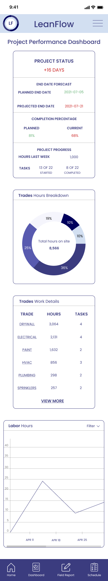
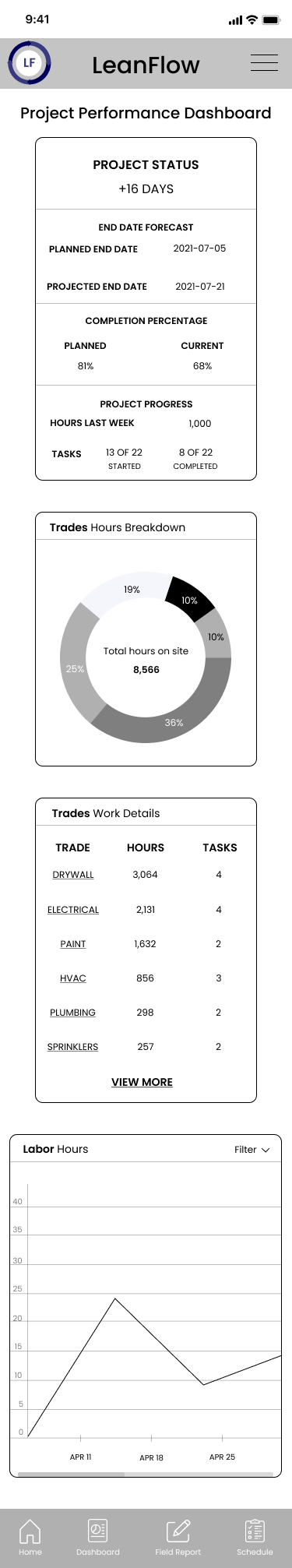
The stakeholders did not believe that the old designs were as simple to use as they would have liked. The previous designer used several bright colors that the stakeholders on this project felt were juvenile and outdated. Those colors also presented an inconsistent look and feel to the design. In evaluating the dashboard, I felt it was lacking a clean and concisely presented project status that provided an overall summary of the work to be done and the time to complete that work. I found this to be a gap in the pre-existing designs that I identified after hearing the stakeholders requirements.
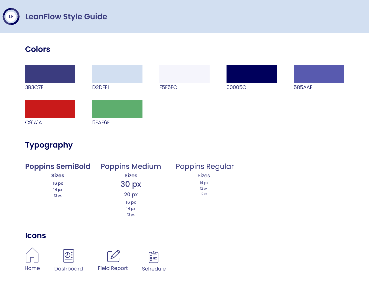
Style Guide and UI Designs
Style Guide
The clients requested that I remove the juvenile colors from the previous designs and asked that these new designs look consistent and uniform throughout each page. Because of these requests, I wanted to give the mobile app pages a clean and concise feeling so that allowed me to choose this font and color scheme.
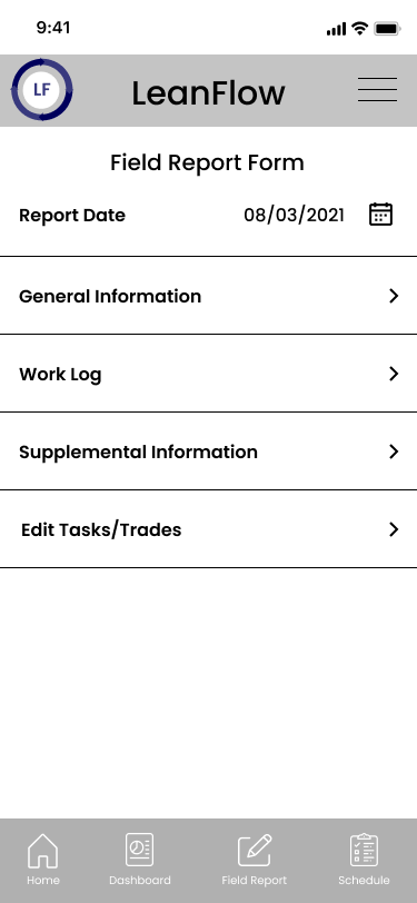
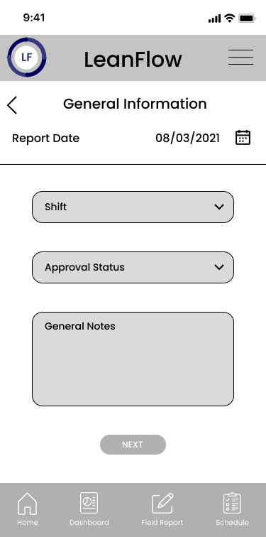
Wireframes
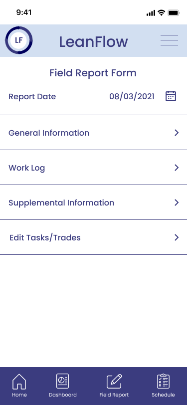
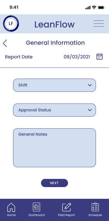
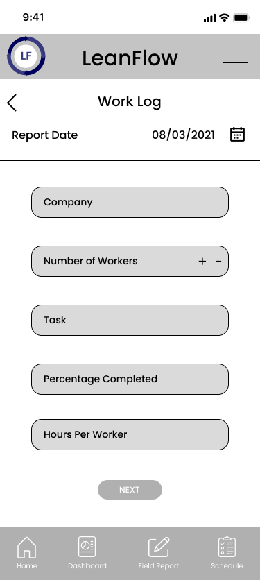
Before creating my full UI design, I created a wireframe for 5 different pages that were discussed with the stakeholders at DB partners. I wanted to give the user a feel for what the dashboard and field report forms would look like. These wireframes show the blueprint of what the mobile application will look like before adding in UI elements.

UI Designs
The goal for the UI designs was brand uniformity. The stakeholders of this project stressed the importance of this throughout our conversations. I chose these specific colors and design elements because I wanted to keep that simplicity that the client requested.