Martini, Benisatto and Reinfurt, CPAs PC
Rebranding and Responsive Website Design
Background
MBR CPAs is a full service accounting firm located in Melville, NY on Long Island. They have been serving a widely diversified client base for over 20 years. MBR provides quality tax, accounting and consulting services to individuals and businesses. They dedicate themselves to three simple principles; professionalism, responsiveness, and quality. Their services include: tax preparation and planning, small business accounting and payroll and new business formation.
Scope: Responsive website redesign and rebranding logo design
Role: End-to-end UX/UI Designer
Duration: 2 weeks
The Process
Research
Research Goals
My plan was to explore what clients are looking for when searching for an accountant. My goal was to interview and survey people from different backgrounds with a wide range of individual financial circumstances.
Research Methods
User Interviews
Survey
Competitor Analysis
User Interview Findings
I interviewed 3 people ranging in ages from 28-64 years old. All 3 participants own their own property and they all have experience using an accountant. When asked how they would find a new accountant they all mentioned that they would ask friends and family for recommendations. Some things they would look for when hiring an accountant include knowledge base, availability, trustworthiness, reviews and reasonable rates and fees.
Survey Results
I distributed an anonymous survey to potential users and collected 12 responses. These participants ranged in ages from 26-65 years old. 50% of survey participants are married. 8 out of 12 people use an accountant to do their taxes. Those that do not use an accountant use programs such as Turbo Tax, Credit Karma, Tax Act and H&R Block. 3 people answered that their accountant is a family member or a friend and 4 people said their accountant was referred to them by someone they know. A few features that people look for in an accountant are price, experience, good reviews, attention to details, responsiveness, location, certifications and trustworthiness. When participants were asked how they would seek out a new accountant, they said they would seek referrals and recommendations from friends, family and co-workers, conduct an online search and read online reviews.
Competitor Analysis
I chose to look at 4 different accountant websites. I considered two firms to be direct competitors because they are located in Melville, NY. I also chose to look at a large nationwide firm as well as another firm that is located in New York City.
Wagner & Zwerman LLP, CPAs
Nawrocki Smith CPA & Business Consultants
Deloitte
Marcum Accountants & Advisors
Each of these 4 websites have many great features that MBR can benefit from. All sites are clear and easy to navigate. They each offer a search bar option to help the user navigate and locate what they are looking for.
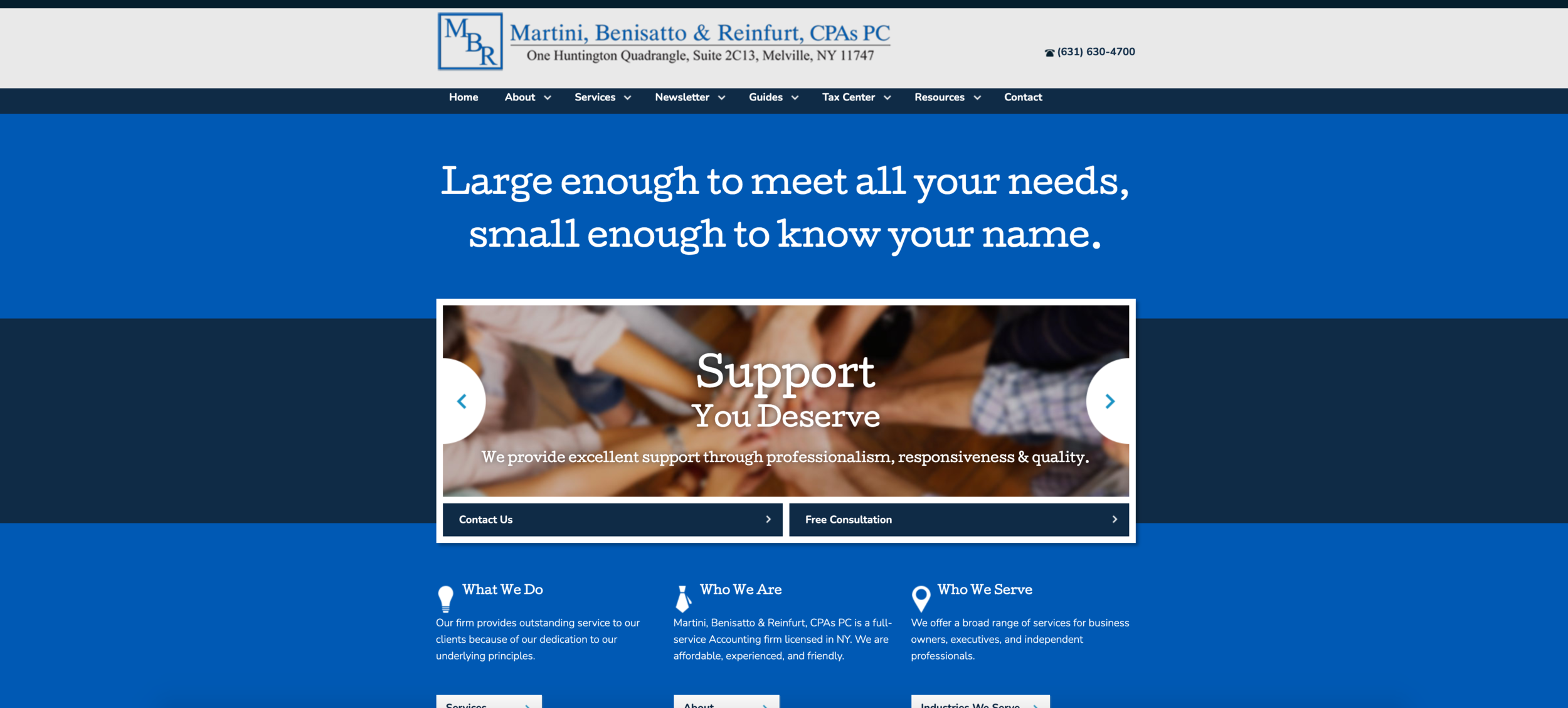
MBR’s Current Website
As part of my research, I spent a lot of time evaluating MBR’s current website. I observed that the website currently seems to be very dated, the menu is very confusing and I found many links that did not work.
User Personas
I created 2 user personas based on my research findings. I believe that these 2 personas represent MBR’s main client base. Carol is an older woman that is on the verge of retirement and Robert is a newly married male that just purchased his first home.
About Carol
Carol is a 67 year old teacher who is semi-retired and looking to fully retire in 2021. She has been a full time teacher for 40 years and she now works part time as a substitute teacher. She lives on Long Island with her husband. She has 3 children and 2 grandchildren that don’t live far. She has always done her taxes in the past using an online program but she is looking for a new accountant to assist her because her retirement has made her finances a little more complicated.
About Robert
2020 was a big year for Robert! He got married in February and purchased his first home with his wife on Long Island in June. Robert has never used an accountant before but his taxes are going to be pretty complex this year so he’s been asking friends and family for recommendations. He never uses a service without doing his homework first and reading reviews. He knows that he can get a pretty good tax break because he purchaed a home but he wants to make sure he does everything correctly and gets as much money back as possible.
Card Sort
In order to create a new sitemap for MBR’s website, I had 10 participants complete a closed card sorting activity.
Participants were asked to categorize cards into 6 different categories. These categories are all currently on MBR’s website. I wanted to get a feel for how potential users would categorize the given cards without any additional knowledge about the current website.
About
Services
Guides
Newsletter
Tax Center
Resources
This diagram shows how many times each card was put into each of the 6 categories.
Sitemap
I was able to make adjustments to MBR’s current sitemap based on the results of the card sorting activity.
Responsive UI and Logo Design
Once I completed the research and define phases of the design process, I had a better understanding of who MBR’s audience would be. This allowed me to move onto the ideate phase where I created new logos, selected new images, colors and typography and completed a complete new responsive website design.
Logo Design
After brainstorming and sketching out different logo ideas, I turned to Figma to bring a few options to life. Below are the 6 different logo designs that I presented to the client.
Style Guide
The style guide below shows several different elements that I planned to incorporate into my UI designs. The logos that are shown were the 2 that were favored by the client. In terms of the color scheme, I wanted to keep it consistent with the colors that are used on the pre-existing website, which is why I chose these 2 shades of blue. I felt that the site needed a pop of color so I chose to include the orange as a call to action color. The fonts I chose are meant to keep the site looking professional and clean.
Wireframes
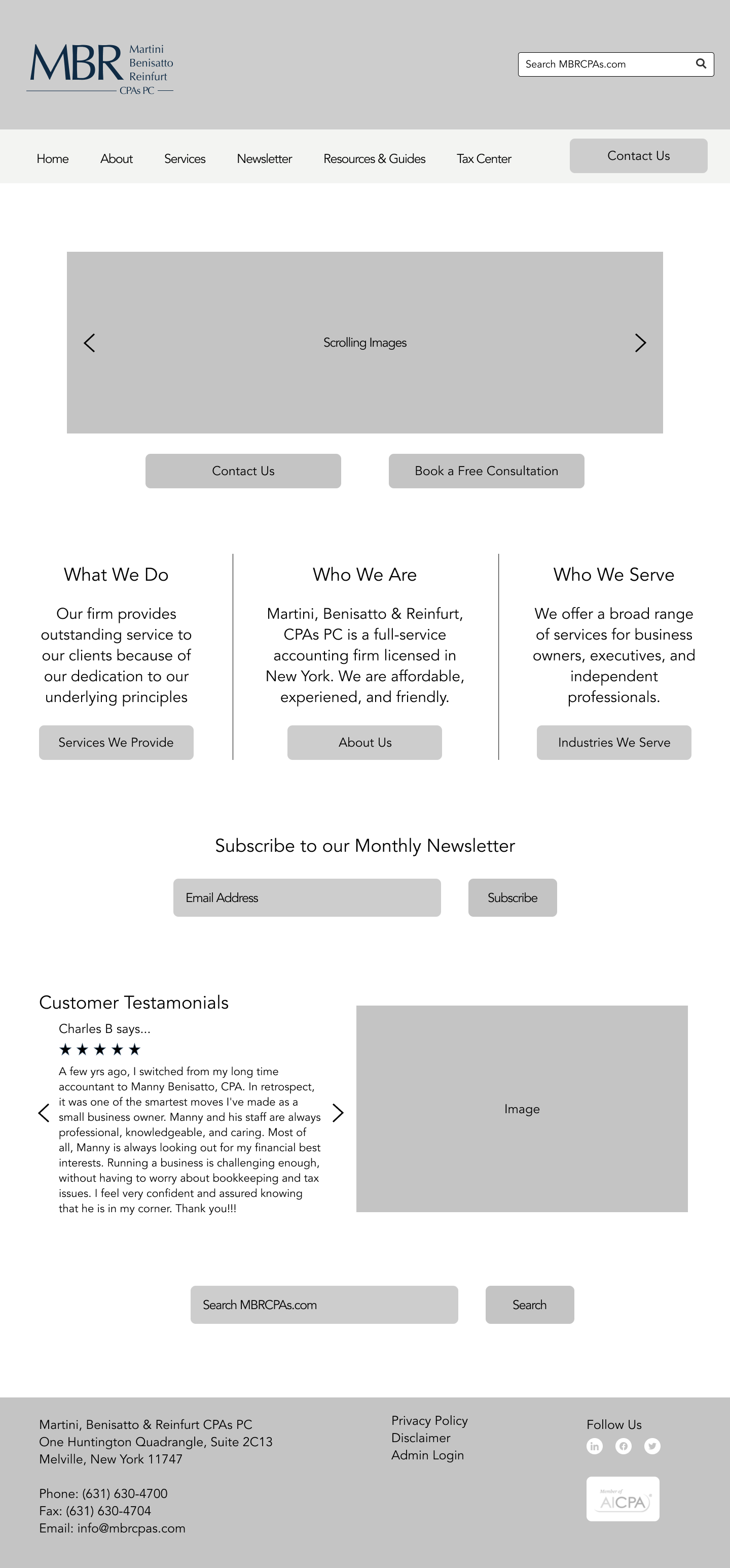
Before creating my full UI designs, I created a wireframe for a few different pages. I wanted to give the client an idea of what their potential clients will see when they first look at MBR’s website. I chose to keep the contents of the website the same but wanted to give the site a refreshed and more professional look and feel. This included evaluating the current usability of the existing website. My primary objective was to create a website design that would be easy to use and allow clients to find information in an easier way than what MBR’s current site is able to offer. These wireframes show the blueprint of what the site will look like before adding in UI elements such as color, typography and images.


Responsive UI Designs
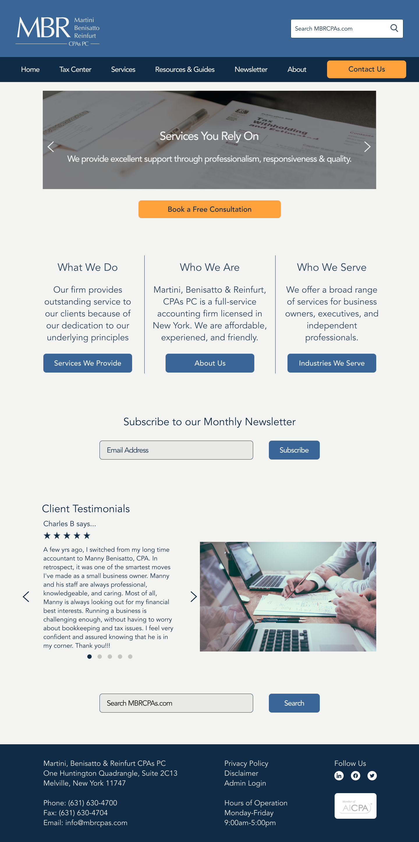
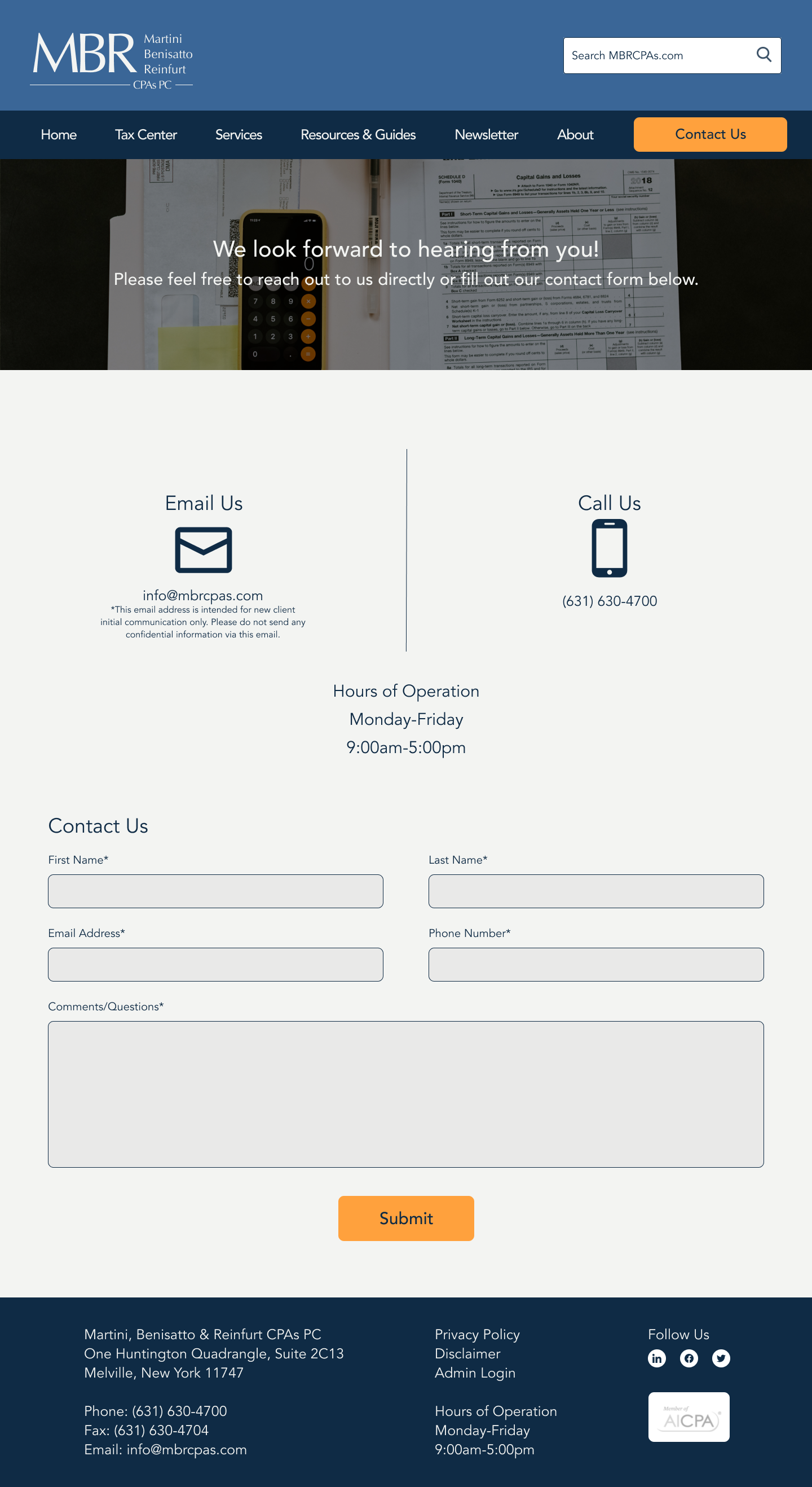
The designs below show my original responsive UI designs. I incorporated elements from my style tile and I settled on the logo that the client liked the most. I chose a few different professional images for my designs to go along with the overall look and feel of the website. As I mentioned before, I chose these colors because they are similar to the colors that MBR is currently using and I added a bright call to action color as well. After completing my original designs, I conducted a usability test to gain feedback on what needed to be adjusted throughout the designs.

Usability Testing
Following the ideate phase, I wanted to test out the usability of the new website designs. Below is more information about how I went about testing these designs and making changes.
Objectives
The objectives for this usability test were to see how easily a potential client can navigate this website to determine if they want to contact MBR. I wanted to test the overall ease of use of the website and find any features or design flaws that caused frustrations or hesitations for the user.
Scenarios
I created a high-fidelity prototype in Figma based on three scenarios.
Scenario 1: You were referred to Martini, Benisatto & Reinfurt, CPAs PC by a friend in the area. You decide to take a look at their website and read reviews. How would you go about looking at their website and filling out their contact form?
Scenario 2: You came across MBR CPAs through a Google ad when you were searching for someone to help you with your taxes this year. You want a little more information about the staff and their experience. How would you find this information?
Scenario 3: You are a current client of MBR CPAs and you need to find out what is due in April 2021. How would you find this information?
Findings
Participant 1 was able to complete each scenario quickly on both the mobile and desktop prototypes. For scenario 1 he scrolled through the home page to find the client reviews before clicking on the call to action Contact Us button at the top of the page. He was able to find the “About Us” page 2 different ways from the homepage in both the mobile and desktop prototype for scenario 2. It took him less than a minute to navigate to the April due dates in scenario 3. Overall, he said that the design is much more clean and modern than the current site. He also mentioned that it is easier to navigate.
For the first scenario, participants 2 did not look for reviews. She immediately went to the “About” link from the homepage. For scenario 2 she was able to locate the “About” section through the navigation bar and the homepage. Scenario 3 seemed to be a little more difficult for her. She attempted to look under “Resources & Guides” to find tax due dates before looking under “Tax Center.” Before scrolling down to see the full vertical timeline she attempted to select the link for “important due dates for individuals.” Once she realized that wasn’t clickable she was able to find the April 2021 due dates in the vertical timeline.
Participant 3 was also able to complete each task quickly on both the mobile and desktop prototypes. For scenario 1 she mentioned that she would select “Book a Free Consultation” before selecting “Contact Us.” She also did not look through the homepage much. While completing scenario 2 she mentioned that she would want to check under services to see what they offer before looking at their bios. She then would select “About” to read more about the staff at MBR. She easily found the tax due dates and April dates in scenario 3. On the mobile prototype she didn’t find the menu as easily as the other 2 participants but was able to complete each scenario easily. She mentioned that she liked the website design and found it easy to navigate compared to MBR’s current website.
Suggested Changes
Change “Resources & Guidelines” to “Additional Resources”
Make FAQ as its own category or add a link under the “About” section. This can also be added as a link on the homepage.
